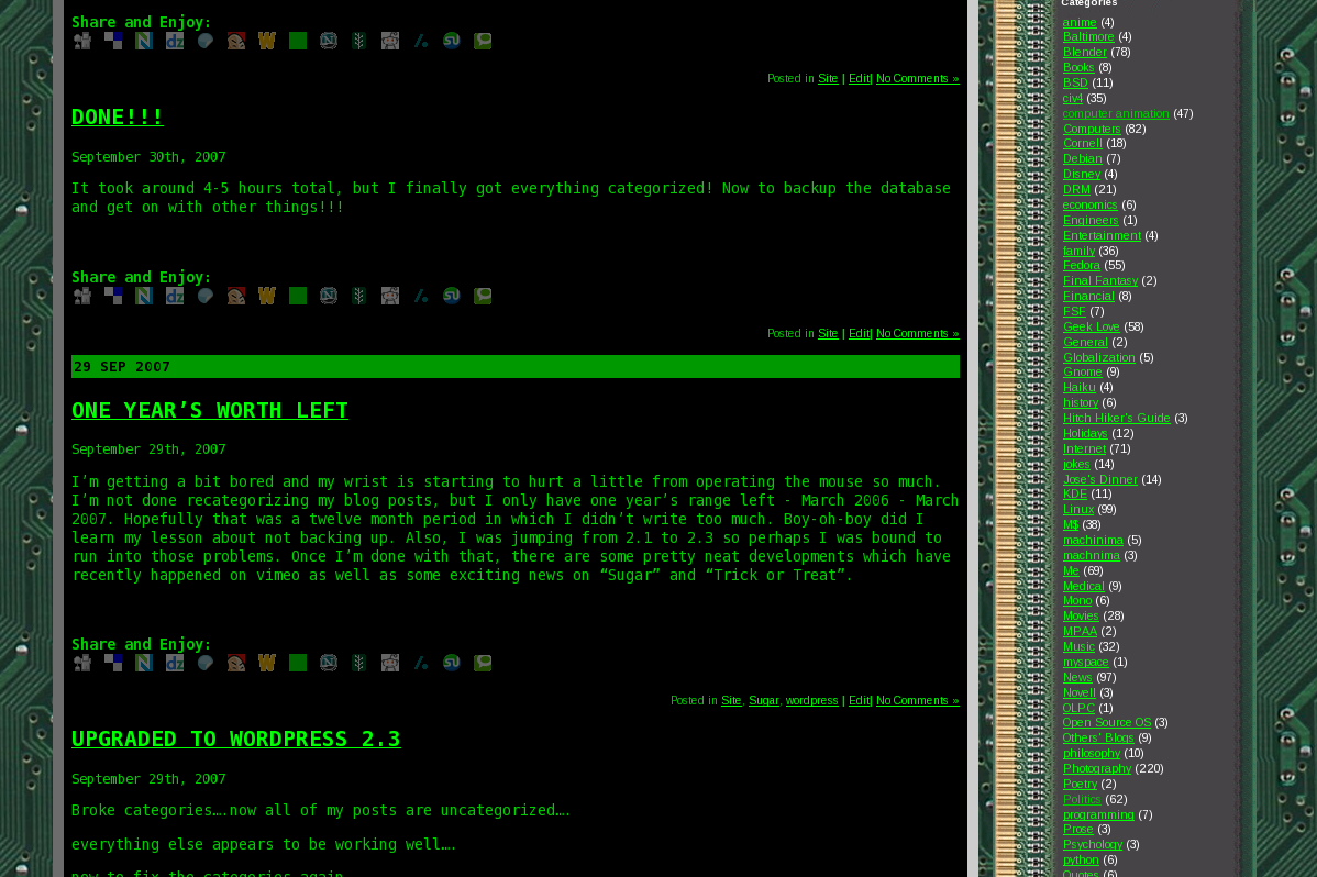
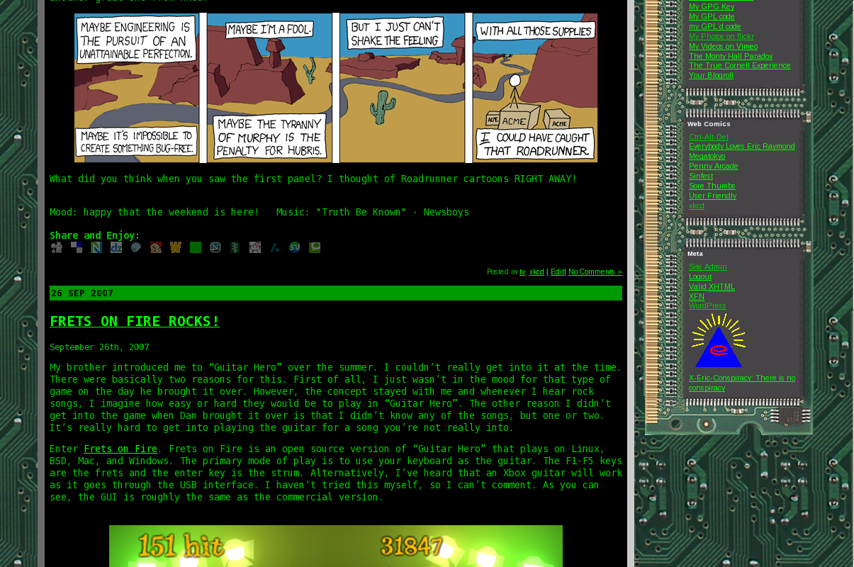
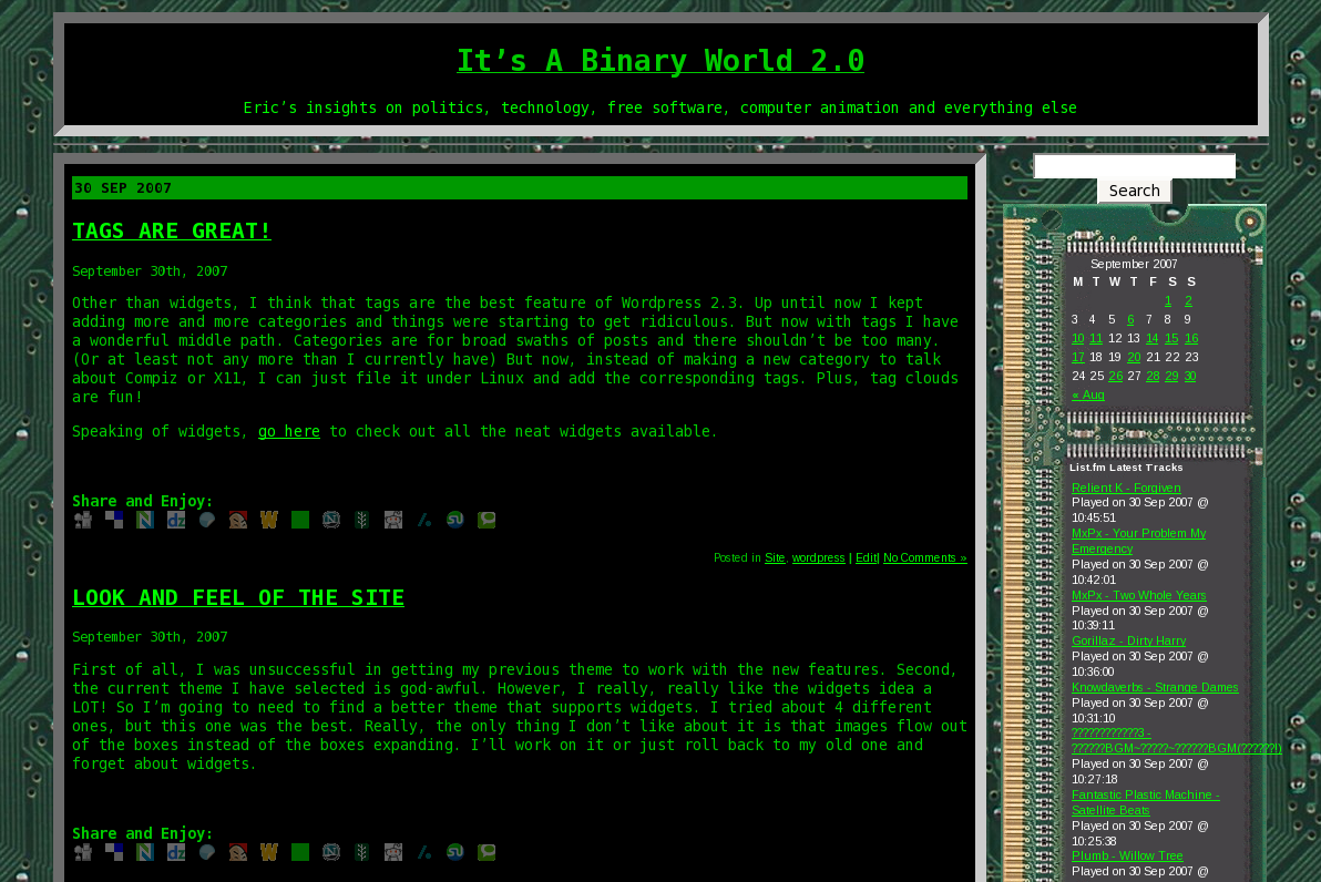
I had the ramart theme for over 2 years, since announcing it in this post. I’ve had it for practically the entire life of this blog, so I thought it would be fitting to record how it looked. Perhaps I can go back to it if I can convince someone to redo it as a WordPress 2.3 compliant theme or perhaps it’s time to move on. I haven’t really decided just yet.
Well, here are the screenshots (for memory’s sake):
2 responses to “A reminder of my previous theme”
Oh, no no! Stick with the new theme! It’s refreshing. Blog themes are like shampoo – you have to change them every now and then or they stop working.
The comment box still doesn’t fit into the template, though.
The words I’m typing are spilling over to the sidebar. I have 1024×768 screen resolution, if that helps. What’s going on is probably you have a fixed-width box in a liquid percentage div, without overflow set to scroll.
But the old style seemed a little old-fashioned to my eyes. I get the point with green text on black, like a console, and the circuit boards on the side, but after awhile it becomes trite to make a geek blog look like an overstatedly geek blog.
Of course, you should listen to anybody but me about aesthetics, since I color my site like a set of Dr. Denton pajamas! (o;p
Weird, the comment box works well on my monitor, but it’s not a widescreen. I think that’s what I didn’t like about the theme. I want one that expands depending upon how large the screen is.
Well, it’s grown on me and I don’t mind it for now.