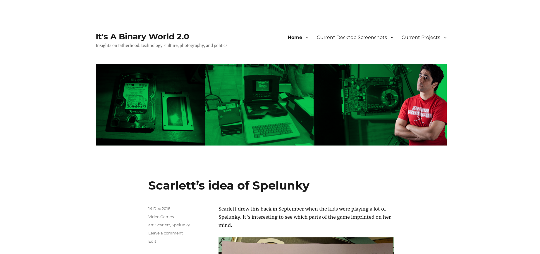
Below you will find pages that utilize the taxonomy term “Theme”
Postsread more
Changing To a Block-Based Theme (Twenty Twenty-Two)
Interestingly enough, I was originally exploring whether to change to the new Bjork theme I’d just heard about. Unfortunately, unlike previous theme changes, it required me to completely redo my homepage while the page was live. It was NOT a good experience. But I did start playing around with the built-in themes. For the past few years I’ve found that I have preferred the built-in themes to anything else out there.
Postsread more
Forgot to document my old theme!
When I switched to Twenty Nineteen almost a year ago, I wasn’t sure if I was going to stick with the theme so I never did my theme documentation blog post. So here’s what the previous theme, Twenty Sixteen, which I had for about 2.5 years, looked like:
And here are the previous theme changes:
/2018/12/14/just-switched-to-twenty-nineteen-theme/ /2015/04/21/lets-do-the-theme-change-again/ /2013/04/18/changing-themes-after-4-years/ /2009/02/05/changing-themes-again-2/ /2008/04/09/changing-themes-again/
Postsread more
Just switched to Twenty Nineteen Theme
I’m not sure I like how the main blog page looks. While it seems to copy something like Ghost or Jekyll (some of the Wordpress competitors popular among the technical set), It has something of an unfinished look to it. I do really like the way individual posts look, particularly when they have a featured image set. And, to some degree, thanks to Facebook, Twitter, and other sites - users are much more likely to land on a blog post than on the main blog page. But right now I’m not sure I’m happy with the theme. I may switch back early next week. If I stick with Twenty Nineteen, I’ll make my usual post about changing themes that contains some screenshots to remember how the blog looked with Twenty Sixteen.
Postsread more
The New Theme, Version 2
While I enjoyed the new theme overall, one thing was nagging at me as I went to bed last night - the padding around the menu, header, and site identity took up WAAAAAAY too much space. So I made the menu more nested to make it appear on the right as it does in the example site for the theme. I might need to make a few more tweaks to that to make sure certain pages are surfaced rather than hidden.
Postsread more
The New Theme, Version 1
I was looking around recently at the Wordpress annual themes and was looking into Twenty Sixteen. While it hadn’t spoken to me when it was released, it did have some features that seemed perfect for me now. The first is that images are given even more room to breathe in this theme. Since I’ve featured photography quite a bit on my blog over the past 11 years, this was something I definitely wanted. I have toyed with the idea of having a separate blog for my photography that has a dedicated photography theme, but since my tastes are always shifting, I think it’s better to just keep it all together on one blog. Another feature is the addition of pull-quotes - something I was trying to figure out how to do via plugins. Finally there is the sub-title you see above - I love those. I plan to have some fun with it in the future.
Postsread more
Let's Do the Theme Change Again!
Almost exactly two years ago, I changed to the Twenty Thirteen theme. It was a breath of fresh air after what I’d used before. The font is beautiful and it was much less cluttered than the themes I’d used before. One of the things I like is that the color scheme quickly tells the user what kind of post I’m making. In practice, the post types made a bit less sense for the way I blog than if I were a Tumblr refuge, but it does make for a nice, colorful theme.
Postsread more
Pardon Our Dust
Finally switched over to Twenty Thirteen now that Wordpress 3.6 is out. It’s going to take some time for me to get things looking the way I want them. Anyway, I LOVE the new fonts - much better readability than the previous theme.
Postsread more
This'll work for now...
I found a Wordpress theme that I mostly like called Hal 5.0. I think the top image is a little over the top, but the overall theme is ok. I edited the font size up from the default - the font designer must have amazing eyesight. I also added in tag listings into the blog posts. Overall, I’m much happier with this look than with the previous one. I still think that, someday, I’ll make my own theme so I can be completely happy with it instead of finding one that’s good enough on the Wordpress site.
Postsread more
Changing themes again
This theme is really annoying me, mostly because it’s a fixed width theme. That means that the theme doesn’t expand if you expand your Window or have a wide screen monitor. Mostly, it means annoying things like this blog post title. As you can see, it cuts into the metadata such as the date/time. Also this theme doesn’t support tags. So you may see some strangeness as I change themes. I couldn’t find any that I truly wanted and, in the end, I think I’m just going to end up making my own theme.
Postsread more
A reminder of my previous theme
I had the ramart theme for over 2 years, since announcing it in this post. I’ve had it for practically the entire life of this blog, so I thought it would be fitting to record how it looked. Perhaps I can go back to it if I can convince someone to redo it as a Wordpress 2.3 compliant theme or perhaps it’s time to move on. I haven’t really decided just yet.
Postsread more
Look and feel of the site
First of all, I was unsuccessful in getting my previous theme to work with the new features. Second, the current theme I have selected is god-awful. However, I really, really like the widgets idea a LOT! So I’m going to need to find a better theme that supports widgets. I tried about 4 different ones, but this one was the best. Really, the only thing I don’t like about it is that images flow out of the boxes instead of the boxes expanding. I’ll work on it or just roll back to my old one and forget about widgets.