Review: openSuse 11.0 (and KDE 4)
EricMesa
- 9 minutes read - 1809 wordsI’ve never used Suse or openSuse. As I’ve mentioned before, I’ve been a “loyal” Fedora user since Fedora Core 1 and I have Ubuntu on my laptop since it had awesome laptop support. I even got some Suse CDs as a prize for the Letter of the Month from Linux Format magazine. However, I never even tried it at that time as I was mad at Novell for the Microsoft pact. I think it lends a lot of credibility to Microsoft’s BS argument that Linux violates its patents.
But it’s been a few years and nothing horrible has happened because of the Microsoft pact and it came as a liveDVD in the latest Linux Format Magazine. I was trying to wait until KDE 4.1 came out for Fedora so that could be my first experience with KDE 4, but that’s been delayed nearly a month now (while they, rightly, fix some bugs) so I decided to go ahead with the Suse review.
Suse is the second oldest distro that’s still around. It started off as being based off of Slackware and later on was somewhat based on Red Hat, borrowing rpm and some other technologies. Since then it’s gone off on its own and is now considered one of the big boys. A few years after Red Hat shelved its personal distro and converted over to the community-sponsored Fedora, Suse decided to do the same thing with openSuse. Just like Fedora, they’ve had some uneven releases. However, openSuse 11 is supposed to be their comeback release. Historically, Suse has been one of the biggest supporters of KDE as the default desktop although that has fallen off a little seince they’ve been trying to compete with Red Hat in the business world.
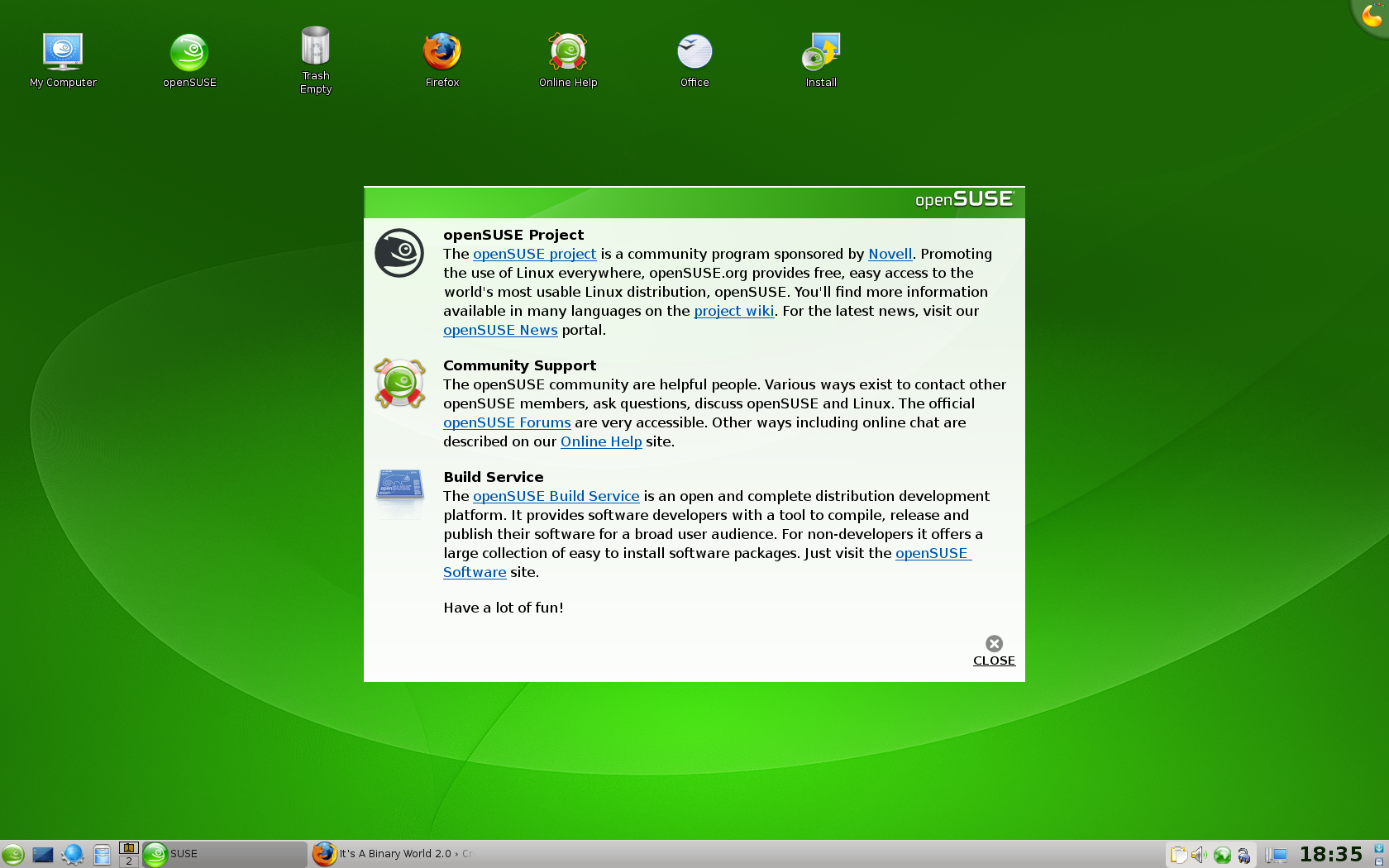
It’s important to note, however, that Novell’s Suse team has put a LOT of work into their KDE desktop. This liveDVD is running KDE 4.0, yet they didn’t seem to have any problems getting icons on the desktop. Lots of people were complaining about being unable to do so in Fedora and other distros using KDE 4. Apparently, they just didn’t take the time that Suse did to engineer a really good KDE 4 release. (Frankly, I’m surprised that Siego didn’t point to openSuse 11.0 as an example of a well-implemented KDE 4.0 release!) They’ve also solved the problem of the ugly black panel that was too large. So, plus points go to Novell’s openSuse/Suse KDE team. They deserve an applause for doing this so well!
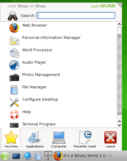
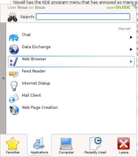
Novell has the KDE program menu that has annoyed so many people. One of the things I’ve always loved about KDE was the fact that it had a favorite (or most run) programs section on the start menu. Sure, there are some that believe that if you’re going to run programs that often you should have them as launchers on your taskbar. But that can make taskbars look a bit cluttered. Also, I think the most used program portion of Window’s Start Menu is one of the things they got very right with Windows XP. (I’m not sure if MS innovated that or copied it from somewhere) This menu is a good menu and doesn’t deserve all the hatred it’s received on the net. It just needs a couple of tweaks to make it perfect. The first problem with it is that if your mouse wanders down to the Favorites, Applications, etc portion of the menu, it switches you to that section. I think a click should be required there to keep people from accidentally switching. That was the biggest complaint most people had and it can be fixed so easily. No need to throw the baby out with the bath water. One other thing that was a bit unclear to me was how to go back on the applications hierarchy. The skinny arrow on the left is not noticeable enough - at least not the first time it catches you off guard.
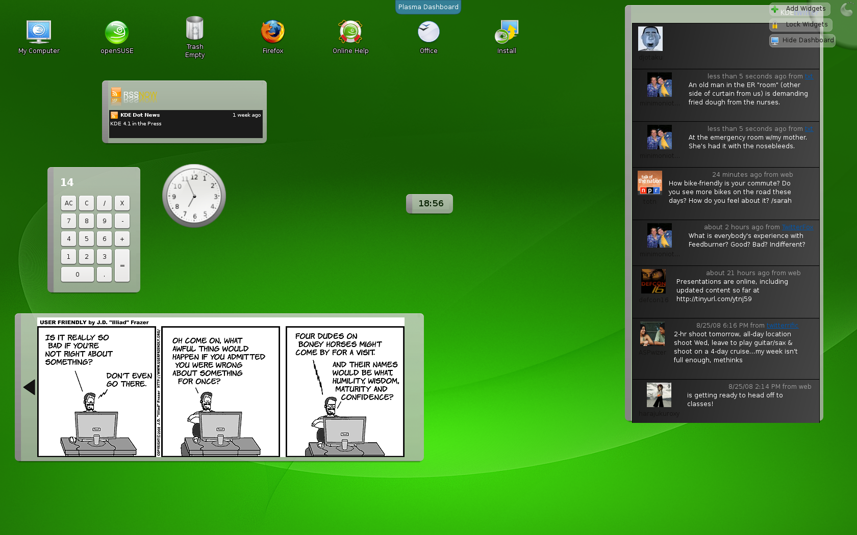
Widgets…it’s one of the biggest, most talked about innovations of KDE 4. There is a lot of innovation going on in KDE 4 and if they can get past the KDE 4.0 stigma, I think they may end up surpassing Gnome with this release. With Superkaramba, KDE has always done widgets so much better than Gnome. Gnome’s desklets always seemed a bit kludgey and tacked on at the end. Superkaramba always felt like it was part of KDE; even before it was added as an official part of KDE 3.5. Now, with Plasma, the KDE team hopes to take them to the level of Apple’s OSX widgets. In fact, OSX widget compatibility is either in KDE 4.1 or coming in KDE 4.2.
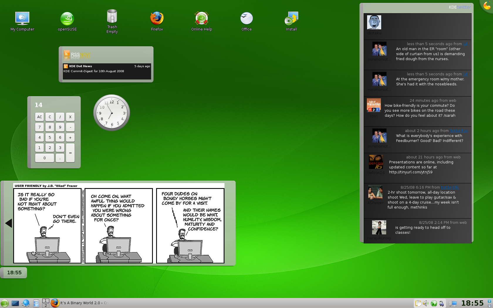
Wow! If you’ve only seen the same old screenshots of a calculator, a click and a notepad, you haven’t seen the true power of the widgets. First of all, they have quite a few new ones now. You can see that I have a comic viewer, an RSS feed, and a Twitter feed. All of these came from the default “add widgets” dialog. I’m surprised, especially given the popularity of Twitter, that no one has showcased these widgets yet. I’m thouroughly impressed that we’ve moved beyond simple system monitors and weather widgets (although I’m sure those are coming soon enough!) They’re very easy and intuitive to position and configure. And, one of the problems I always had with widgets on any desktop was that if I had all my programs open, they were less helpful to me. Well, by clicking on the little button by the gecko or the top right corner, the plasma dashboard view is activated. This minimizes your programs and brings the widgets to the forefront. A simple click on the desktop brings your programs back! Couldn’t be easier. They’re also very pleasing to the eye with their drop shadows. They move smoothly and appear with a little fade-in. Very nice.
As far as programs go, they have a pretty standard set. OpenOffice.org provides the office suite. Again, like with Mandriva, this is a little bit out of place since they could use KOffice. However, I know that OpenOffice.org has much better compatibility with the suite from Redmond. Interestingly, GIMP and Krita don’t seem to be included - but then again, it’s a liveDVD. I’m sure it’s in the repositories.
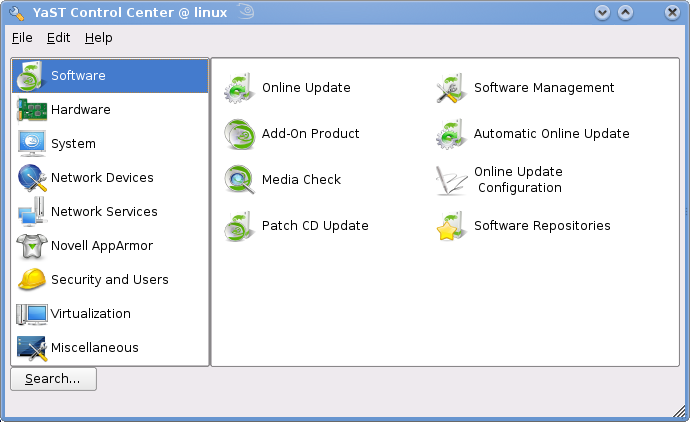
In fact, let’s check out Yast, their control center. It appears to control any setting you might want to change. Plus points for them for making it all nice and organized. In fact, they seem to be on par with Mandriva here in terms of everyting you could possibly want in one place. Minus a very small point for it not looking as pretty as Mandriva or even as pretty as the rest of openSuse 11.0. From here we can install programs. Let’s see how well that appears to work.
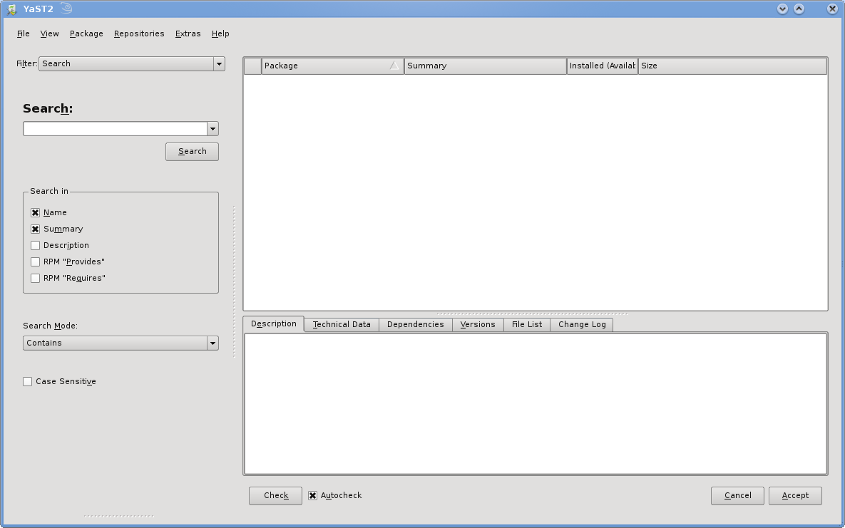
I have to say that it is indeed ugly to look at. I couldn’t really get a good feel for it as it didn’t have repositories defined. I’ve really become much more of a fan of PackageKit’s interface. (Which I’ll talk about in my Fedora review) More and more Gnome-based distros are moving to PackageKit and I think there’s even a KDE version of Packagekit. It works very well for package management and you can’t argue against the value of a consistent interface across distros.
Some last little things I noticed. Take a look at what came up when I clicked on “My Computer”:
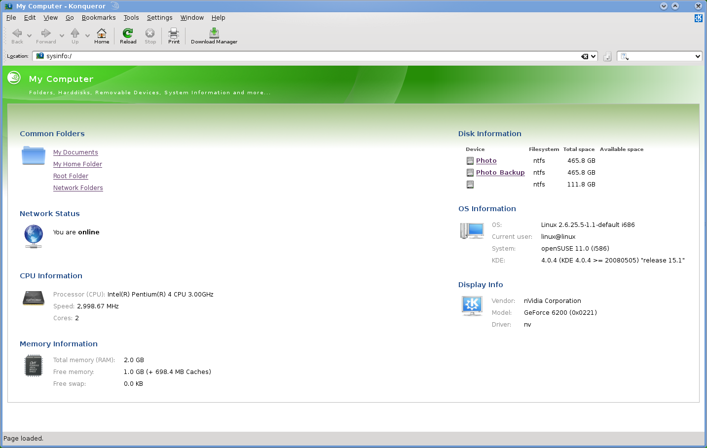
I really, really like this page that it loads up. It is very useful for locating places on your computer AND for getting information. To get the same info in Windows you’d have to open up “My Computer” AND right-click on “My Computer” and click on properties. Here you have some quick links to “Common Folders” and also you can see that it recognized my NTFS hard drives. You also have all the key information you need in order to get help from someone: kernel version, distro, KDE version, graphics card driver, graphics card info, CPU info, and the total and free RAM. Just one look gives you everything you need to know. And I want to finish up with just a quick look at some of the neat finishing touches that Novell has done with openSuse.

Look at that - there’s a little gecko - the Suse mascot on the title bar. This little dude appears on any title bar that has focus. It’s just little touches like this that make the distro seem more professional. I wish more distros would do things like this. And look at this:

Now, this is probably a KDE setting, as opposed to Suse, but good on Novell for leaving it in. There are many things I like about this setup. First of all, the expansion button is not next to the exit button. The number of times I’ve been frustrated by accidentally closing a window when I meant to resize it is just too numerous to count. Also, the up arrow makes more sense to me than Microsoft’s icon. It’s just that we’ve been around with the Microsoft implementation for 20 years.
So, what’s my final verdict? I think Novell has done a really, really good job with openSuse 11.0. Unlike Fedora, they did a very good job with the unfinished KDE 4.0 and turned it into something usable. Lots of visual finishing touches make the distro just feel professional and not hacked together. There are a few rough edges here and there. I also didn’t test out flash, MP3 playback, or DVD playback. I presume these can all be downloaded from some third party repository in some country where they don’t implement silly things like software patents.
Except for the still touchy subject of the Microsoft deal, I’d recommend Novell to someone who was new to Linux but ready to learn. It doesn’t have the same hand-hold style of Ubuntu, so that’s still my top choice. Right now it’s really almost a tie between recommending Mandriva and openSuse as the next best thing after Ubuntu. Fedora is often broken due to being bleeding edge and I wouldn’t recommend it to someone brand new to Linux. Of course, there still is the patent deal and they either did it to make themselves more palatable to companies than Red Hat (thus having bad motives) or they had to satisfy investors (which they legally must do in the USA). So I guess that would break the tie and give it to Mandriva. But Novell has made a top notch distro and if they can get over the negative press from the Microsoft deal (and there are websites like boycottNovell to prevent that), then I think openSuse may end up on more magazine covers and start to steal some of the thunder away from Ubuntu.