Last.fm Beta - A Preview
EricMesa
- 2 minutes read - 254 wordsLast.fm is getting close to relaunching their site and I was invited to participate in the beta program. I think the new design has some great new features and I wanted to share it with you so you could get excited about it too.
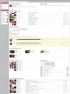
Here’s the main page as it appears now:
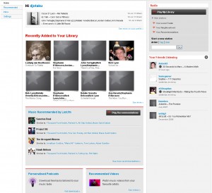
The most important thing to notice is how cluttered it is. Look at the proposed layout under beta:
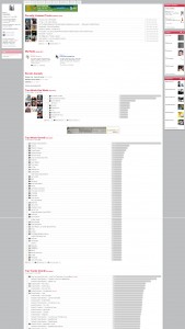
Notice how much cleaner it is. It doesn’t attack your eyes with gaudy sensibilities. Also, the info about my friends is limited to the last song they scrobbled. If I want to get more details, I can click on the names. This philosophy extends to the profile page. Here’s my current profile page:
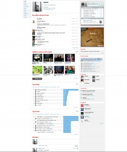
Again, it’s very cluttered. There’s a lot of info and a lot of scrolling involved. Now, check out the beta page:
In addition to being a lot cleaner, it also has a lot more functionality. At the top is a radio ready to play songs from artists I scrobble. The charts are condensed and include info from the past 7 days as well as long-term. I like this because before it was only one or the other on the front page. Also, it appears that it will always show your last week’s worth of scrobbles instead of just updating on Sundays. Overall I’m extremely excited about the new last.fm layout.
One bit of warning, though: This is all beta and could end up radically different by the time they finally launch.


