GOG Galaxy: A Good First Start
EricMesa
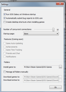
- 3 minutes read - 609 wordsYesterday I put in for the GOG Galaxy Beta and today I got my invite. I couldn’t wait to get home to see it in action. I did not bury the lead, it was exactly as I state in the title, A Good First Start. The settings are so minimal at this point that it doesn’t have any tabs:
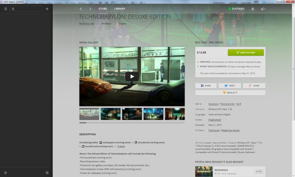
As you can see, many of the most exciting features are marked as coming soon. Still, it’s exactly as I hoped they’d do it. I meant to remark in my last blog post that I hoped they’d make the game pages just like their webpages. I find their webpages very, very useful. It’s less cluttered than Steam and brings the reviews to the fore. Let’s take a quick screenshot tour of the client. (I was going to do a screen capture video, but the client is so simple at this point that a few screenshots will do it justice)
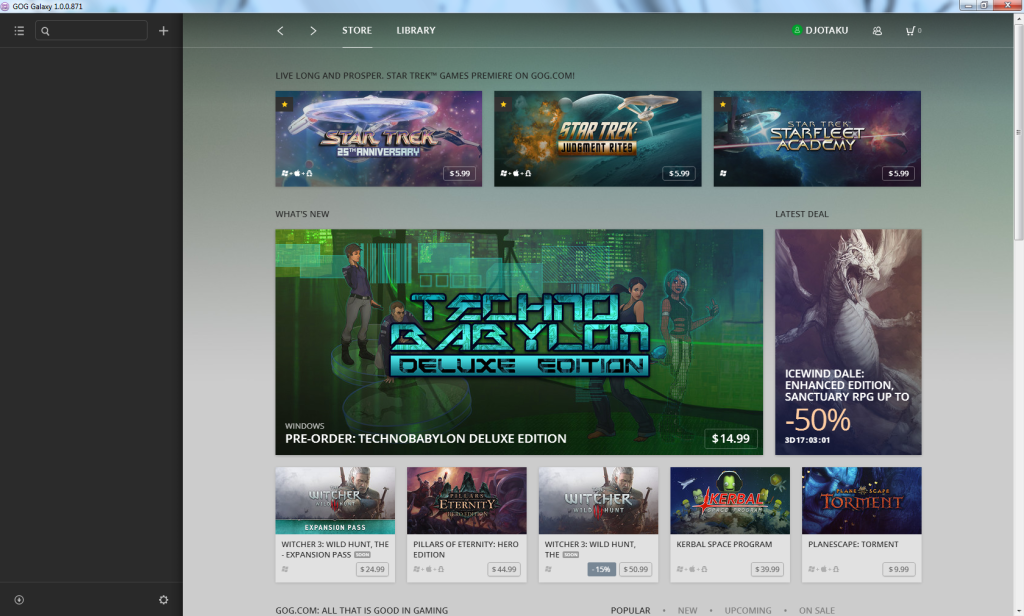 GOG Galaxy Store Featured Page
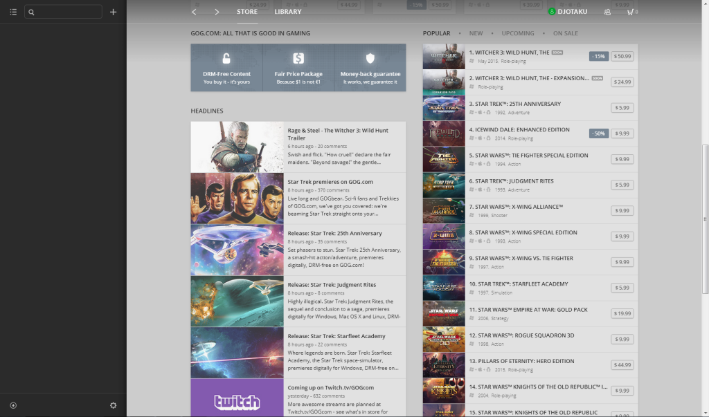 GOG Galaxy Store Featured Page Scrolled Lower
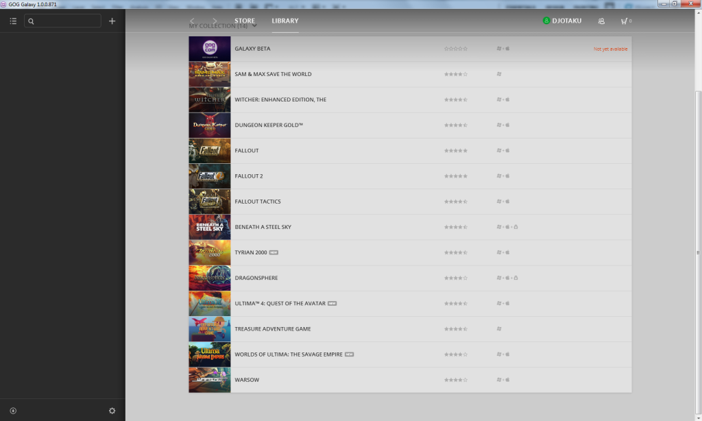
I don’t like the default game list because it’s an incomplete skeumorphism compared to the page on the web:
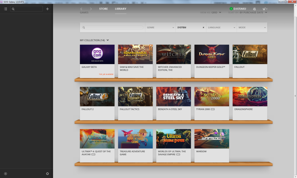 GOG Galaxy - Default Game List
You don’t get the pretty box art or the nice shelves. You just get a bulky view that would not be fun to scroll through if you had lots of games. But I do like the other view currently provided:
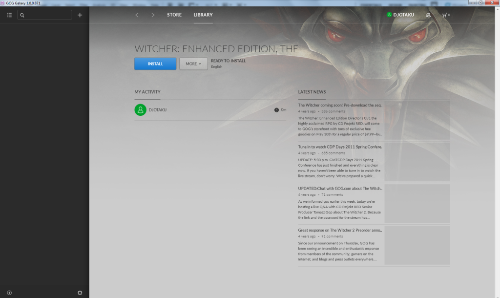
A purchased game’s page is similar to the way it looks in Steam, but more barren without Achievements:
One thing Steam doesn’t do that would be nice for GOG to adopt is to have a description of the game on this page. Just because I bought it doesn’t mean I remember what the game is; especially if I bought it during a huge sale.
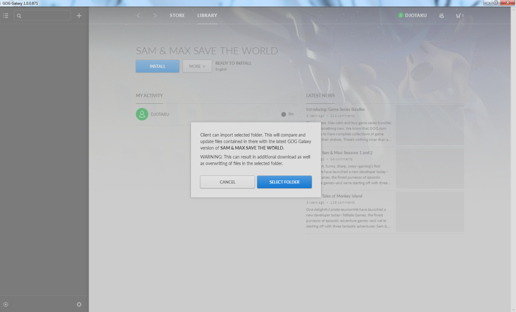 GOG Galaxy - Importing a Folder
I was wondering how they’d deal with old purchases. Under the “More” button you can import a folder if you already downloaded the game. I didn’t try it with The Witcher because I can’t risk it screwing up my save files. I’m too far in to start over. But it seemed to work with Fallout and Dungeon Keeper Gold. With Sam and Max it appears it re-downloaded everything because of a change in folder naming convention. For the other two it did download a small file, so perhaps there was a patch I needed.
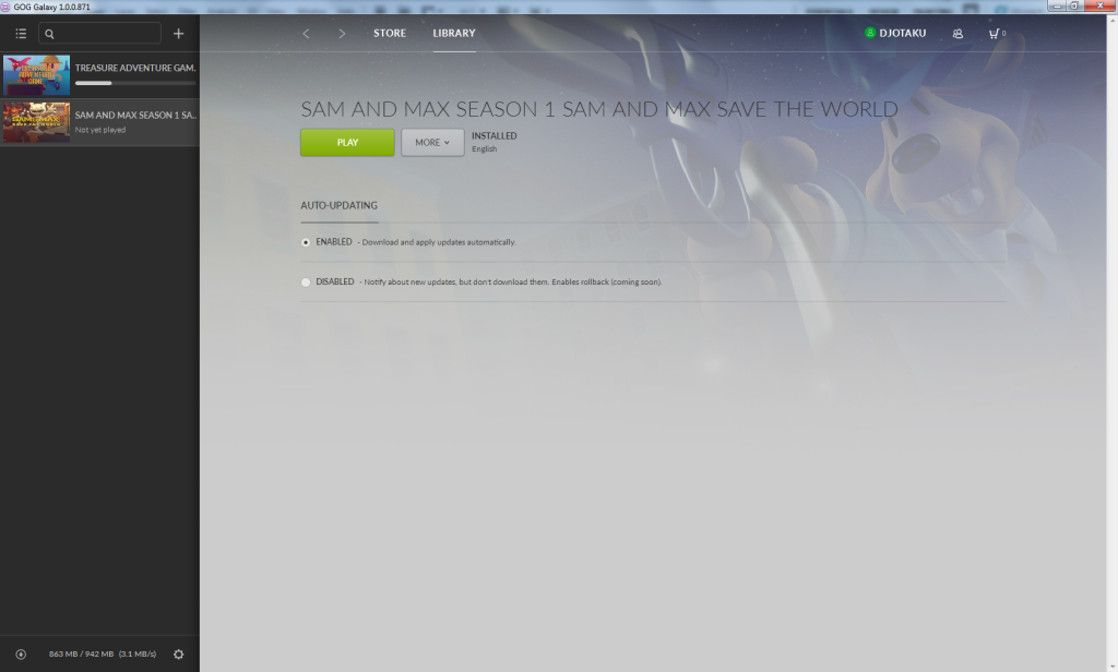 GOG Galaxy - You can set auto-update per game
As you can see on the left, the games you can play are in a column that is visible no matter what page you’re on. Downloads and the queue can be viewed from that little arrow in the bottom left corner. At the moment I’m indifferent to both of these differences from Steam. They’re different, but not necessarily better or worse. For example, it’s nice to be able to launch any game from your library without having to go to the library page. At the same time, it’s not a big deal to just click library. So that’s horizontal space that … well … let’s face it, with Steam on a wide monitor most of that space is just empty anyway. No user-generated categories yet. They do have a comprehensive search on the library page, but I do like to make categories for games I’m currently playing or games I play often.
Overall, it’s a pretty stable beta and they are off to an excellent start. I’m already happier that it can auto-update my games. I look forward to their continued improvements.
