365 Graph
EricMesa
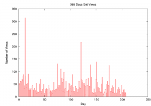
- One minute read - 188 wordsToday I worked on a python program to create a graph of the views of all my photos in my 365 Project set. Here’s the result: (click for full size)
[caption id=“attachment_2937” align=“aligncenter” width=“300” caption=“365 Project Views Graph”]  [/caption]
I was curious how they stacked up and I wanted to see if I could detect any patterns. Except for a few outliers, they’re mostly below 50 views per photo. I also expected to see more views after I started adding my photos to more 365 photo groups, but this is not the case. There do appear to be clusters of views. In other words, one highly viewed photo seemed to lift the ones by it. That one huge outlier is my photo making fun of causes of the swine flu. The other big one is my Heroin Chic photo, no surprises there. It was fun to create this and I learned a new python module. Also, even though it probably took me a bit more time to program than to do it manually, it will now automatically generate whenever I want, and that’s worth the time it took.