Sam and Stella's Five Month Portraits [Studio Style]
By EricMesa
- 5 minutes read - 895 words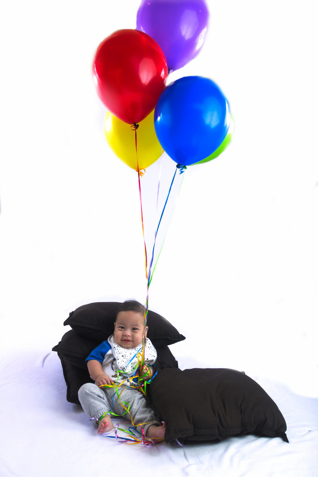
What I edited and what I didn’t
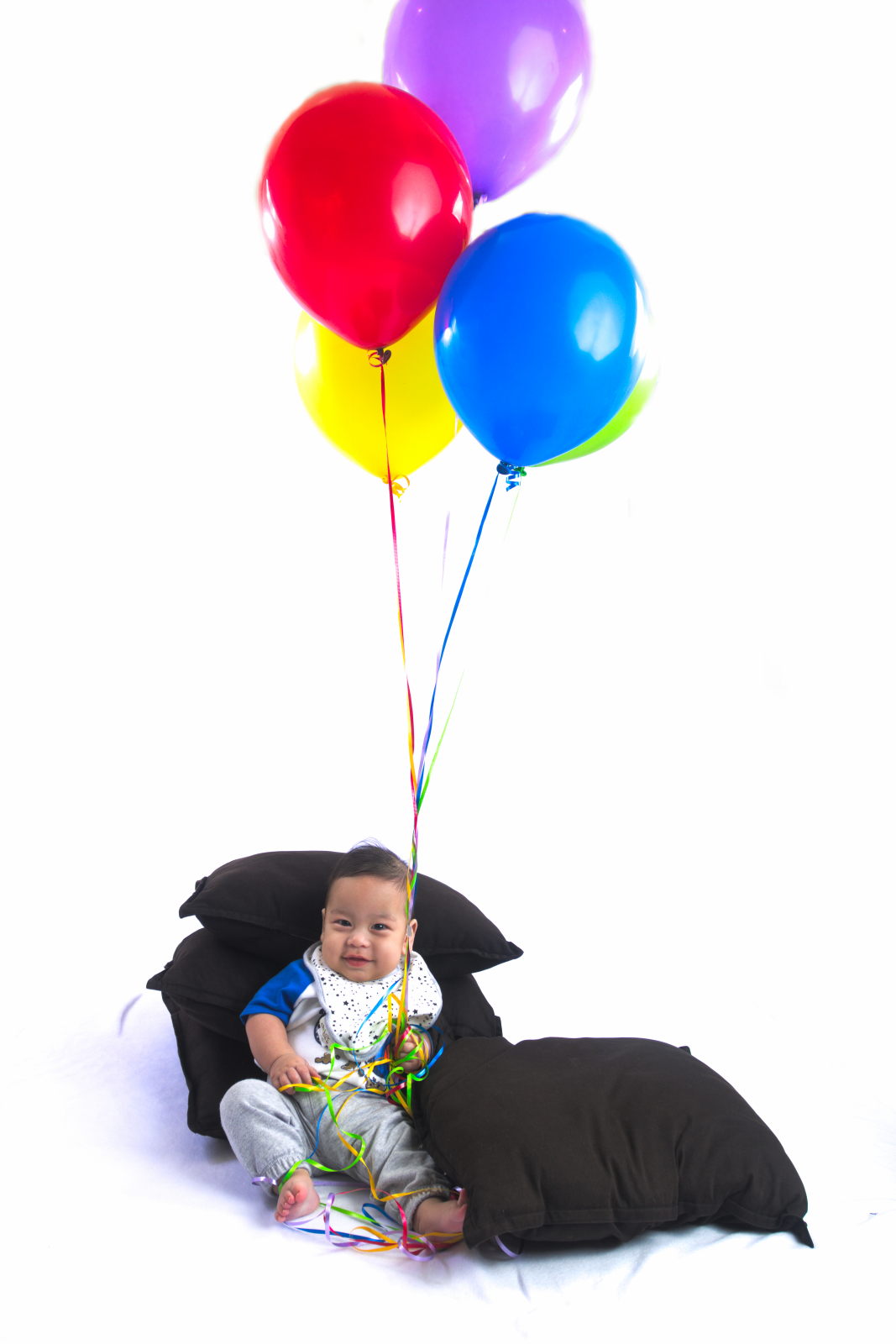
Danielle mentioned that it looked like I’d messed around with the image because the strings on Sam’s photo looked fake. Actually, that’s how it was captured in the camera. The strings were reflective and, as I’m about to get into, there was a lot of light in this shoot. There are only two things I did to edit these photos. For both of them, the balloons ended up floating higher than the backdrop. So I had to extend the backdrop digitally. Luckily for other reasons that I’ll get into in the lessons learned section, I’d been trying to blow out the background and make it pure white. In computer terms, I wanted it represented by (255,255,255) or pure white. So it was less of a pain to extend the background to make it look real - I didn’t need to use a clone or healing brush. It was already white so I just painted in white (I actually did something a little more complex, but this is fine for the analogy). For Sam’s photo, the balloons and strings caused a bit of a shadow behind the strings so it’s not pure white there. The strings are so skinny that it wasn’t worth trying to paint over this with white. I tried a couple times and then gave up and reverted it.
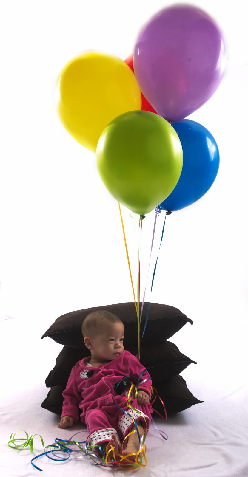
The second thing I did was to use layers and blending modes to bring back some of the color in the balloons. Because of all the lighting I had going on, the balloons got blown out to the point where Danielle thought they looked a bit fake the way they came out of the camera. So I used a multiply blend in Sam’s photo to bring back the colors. In Stella’s photo I created another version of a TIFF with the exposure lowered and then did a blend of that with what I got in the properly exposed photo.
Lighting Diagram
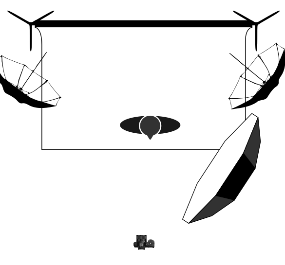
I had two approximately 24" diameter umbrellas at 45 degrees to the background and roughtly 45 degrees to the ground. This was to try and drive the background and floor to pure white. I had a 47" octobox at a 45 degree angle to the background, about a foot or two from Sam or Stella.
The lighting diagram was created from an SVG put together by the wonderful folks at Pixls.us. You can get it and also contribute at the Github for the project.
Lessons Learned
First of all, I love the giant octobox. This is my first time using a light modifier this big and I LOVE how nice and softly it produces shadows. Perfect for work with babies. There’s still some definition given to the subject, but with just one light, the photograph is already in a pretty good place
Second, I was originally intending to photoshop (or GIMP) away the cushions behind the kids. I thought I might even insert a sky behind them a la Pixar’s Up. This led me to try and ensure the background was pure white to make it easier to manipulate. However, with a white background this just created too much light and threatened to overpower the key light. At the very least this was the case in my small basement studio. In a larger studio this might very well be a perfectly valid strategy. I am reaching the point where experimenting with more than one light is becoming hard without a light meter. It’s not impossible to do without one, it’s just more time consuming.
I’ll need to experiment, but I think I know how I could have achieved a similar goal without over exposing the balloons as the light bounced back. I have two things I want to experiment next time around. One is to ensure that I’m keeping the light at least one stop lower than my key light. I’m not 100% sure of how to measure this without a meter, but it’s certainly something to experiment with. Then, I will probably also use a lower shutter speed. Generally speaking, the aperture controls the lighting and the shutter speed controls the background. What happens when the background is also lit? I’m not entirely sure. But something tells me that if I’d eased up a bit on the shutter speed - maybe going from my default of 1/200s to 1/100s - I may have achieved my goal of pure white on the background without affecting my subjects. The other thing for me to try is to confirm how to change what RawTherapee considered blown out white (like the inverse of the shadow slider) without making the rest of the image over-exposed.
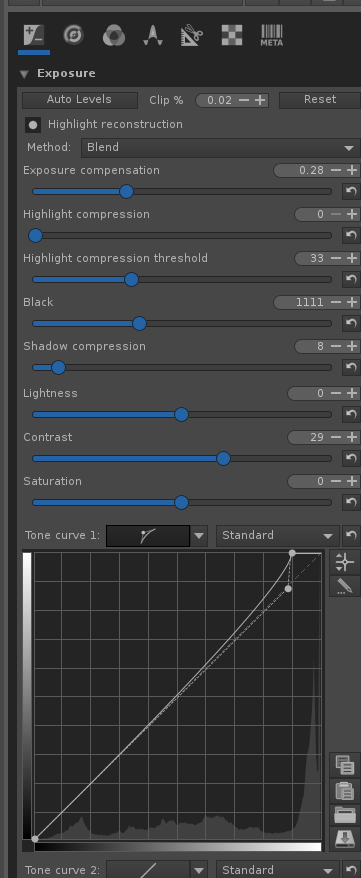
Before publishing this post, I did mess with the following slider in RawTherapee:
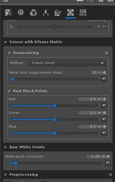
I’m not sure if that’s the correct way to achieve the effect I wanted. But it worked in giving me a much cleaner image for Sam’s photo - much closer to what I wanted and with less messy boundaries where I had to remove the room:
After asking on the RawTherapee forums, I found out that actually the correct way to do this is to move the right-most dot on one of the tone curves. Like this:
That gives me a photo that looks like this:
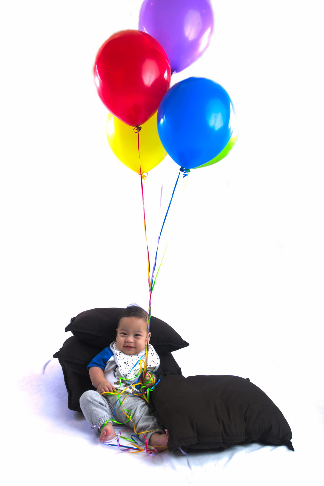
Which is more or less perfect and the version I’m going to print for my office.