Color Trends in Science Fiction and Fantasy Magazine Covers (by Magazine)
EricMesa
- One minute read - 209 wordsWhen I was looking at my SFF magazine covers on Calibre-web, I noticed there seems to be somewhat of a house style to the images chosen for the covers. I know I could write a python program to give me a definitive answer, but I’m not currently in the mood for that. So here’s what I saw as the main theme for each of the magazines I’m subscribed to:
Lightspeed Magazine
The main impression I get with the covers (from the issues I own) is that a successful Lightspeed Magazine cover has orange in it.
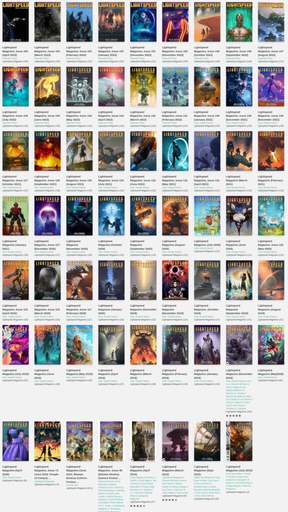 Lightspeed Magazine covers
Uncanny Magazine
By contrast, Uncanny Magazine covers have lots of blues or purples (with green a strong second place). I’m not sure how to explain this, but those colors make sense to me with a magazine that has a unicorn as its mascot.
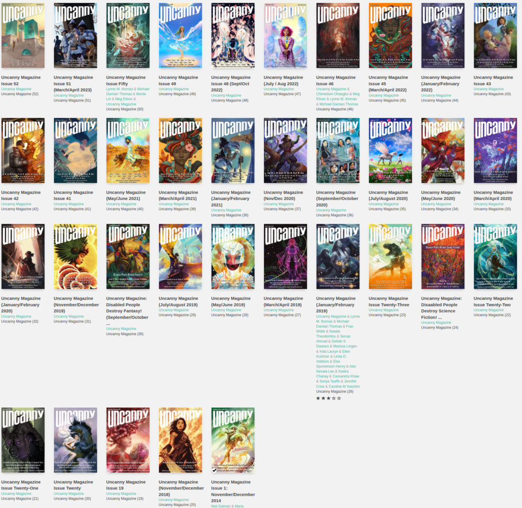 Uncanny Magazine covers
Clarkesworld Magazine
For Clarkesworld, there wasn’t any particular color that stood out to me, but the predominant distinguishing feature was the brightness of the covers.
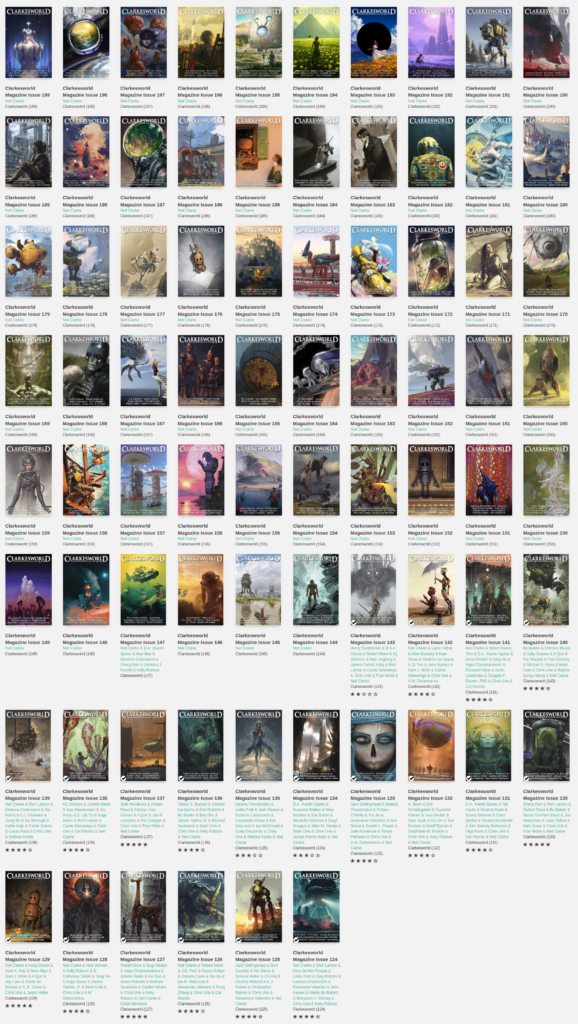 Clarkesworld Magazine Covers
Apex Magazine
I’m not sure if it’s because I just don’t have enough issues or because Apex is more random in its illustration choice, but I couldn’t figure out a theme to these covers.
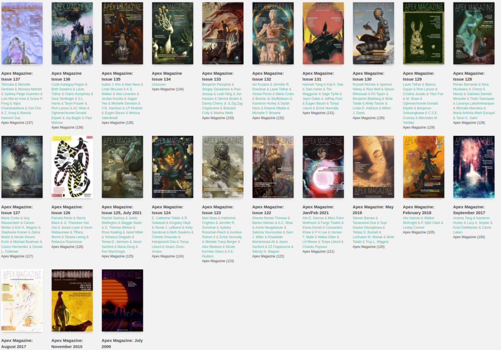 Apex Magazine Covers