Vivaldi On Windows Part 1
EricMesa
- 4 minutes read - 755 wordsThis is the first post continuing my exploration of web browsers outside of Firefox and Google Chrome. You can read the introduction here.
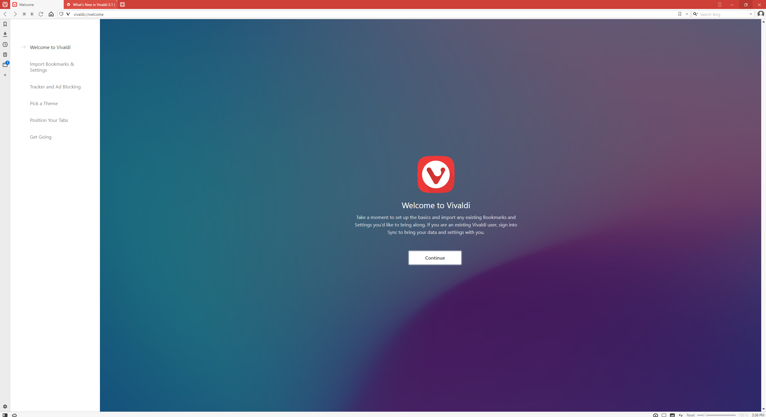 Running Vivaldi for the first time.
For the first browser I wanted to check out on Windows, I decided to check out Vivaldi. My thought process is that I’m most likely to end up with Brave, so better to save that one for last. But as I went through the first-run process in Vivaldi and saw the nice polish the browser seems to have, it really started tugging on me, saying, “Are you sure you wouldn’t want to just stay with Vivaldi?” For this first post, I’d like to cover the first-run process and then a little video poking around the interface. This’ll be followed up in a while with any impressions I’ve come away from my usage of Vivaldi on Windows.
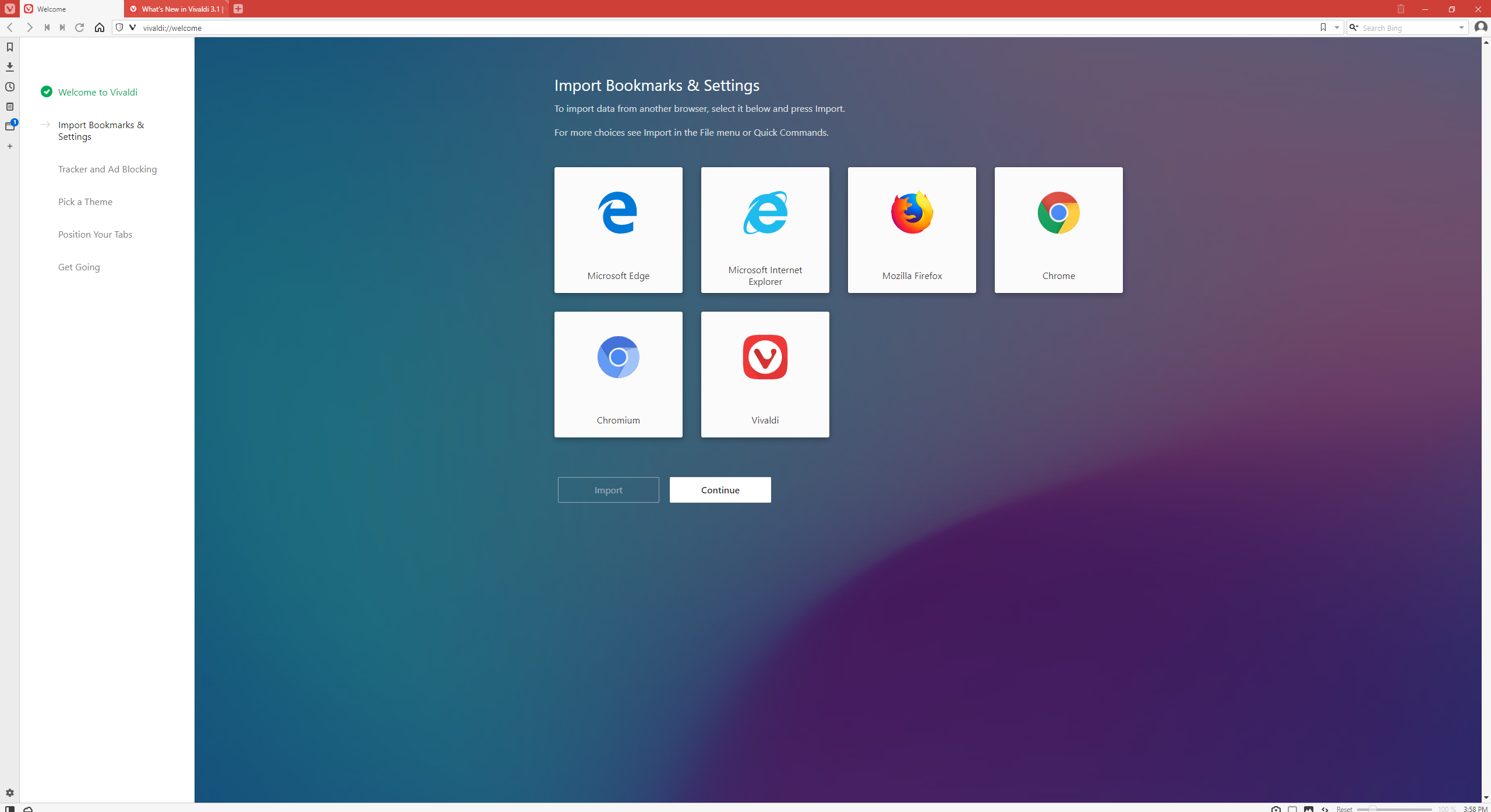 Vivaldi asks if you want to import bookmarks and settings from previous browsers.
During import settings, it appears to just list every major browser (and Vivaldi) regardless of whether you have it on the system. (Or maybe I’ve installed Chromium in the past and the config files are in the Windows equivalent of my home directory?)
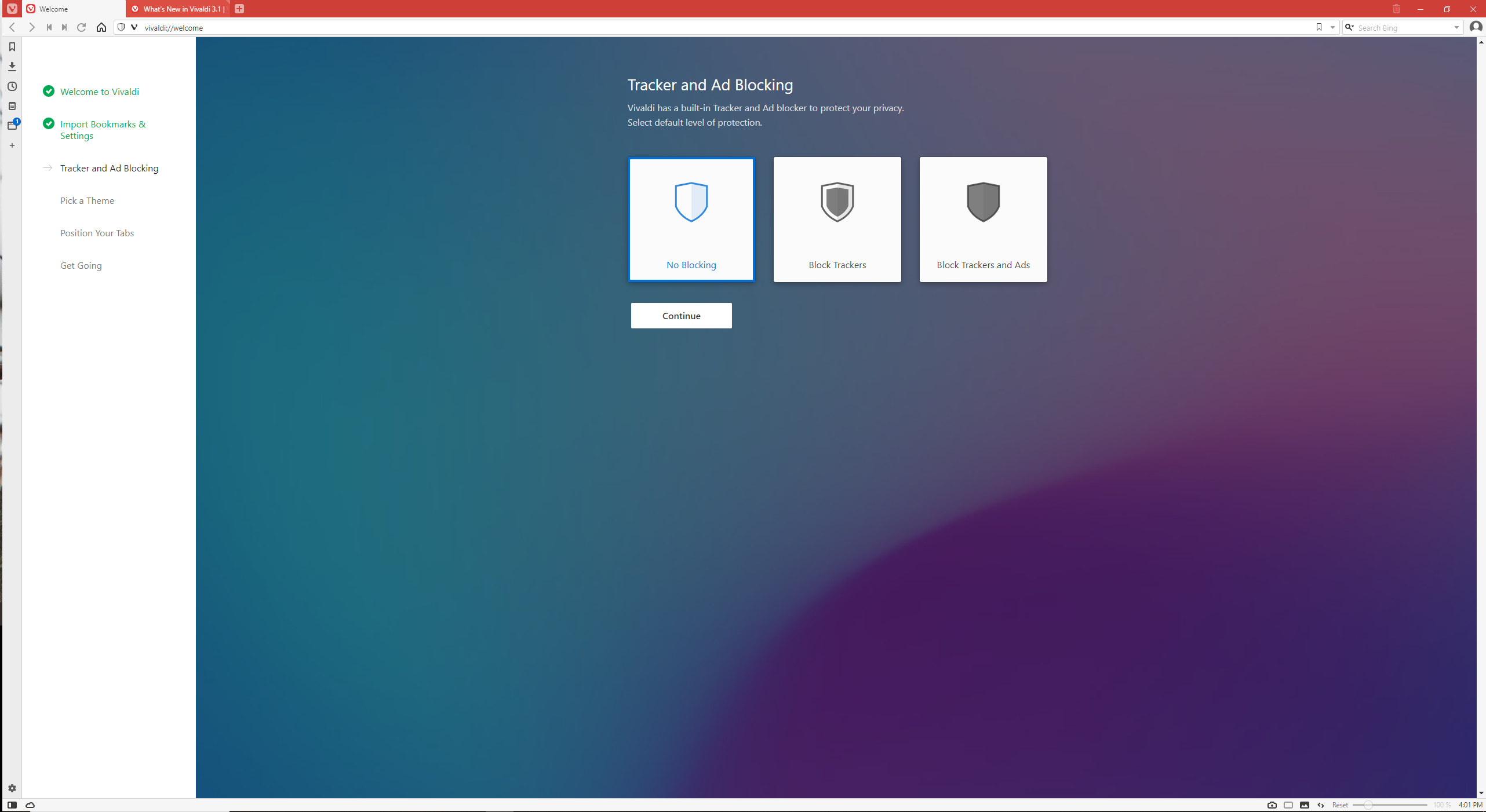 Deciding if you want to enable ad and/or tracker blocking
I found this to be a very interest settings page. When they ask you about blocking trackers and ads, who the eff chooses not to even block trackers?!? Of course, I understand not blocking ads so that sites can get paid. But I don’t understand who *wants* to get tracked (other than researchers) I’m going to block everything and then see if sites later ask me to whitelist them - that would give me some insight into what the whitelist tool looks like.
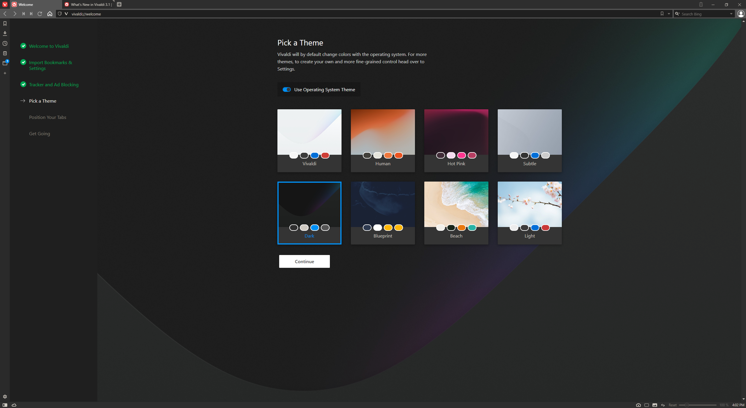 Selecting the color scheme
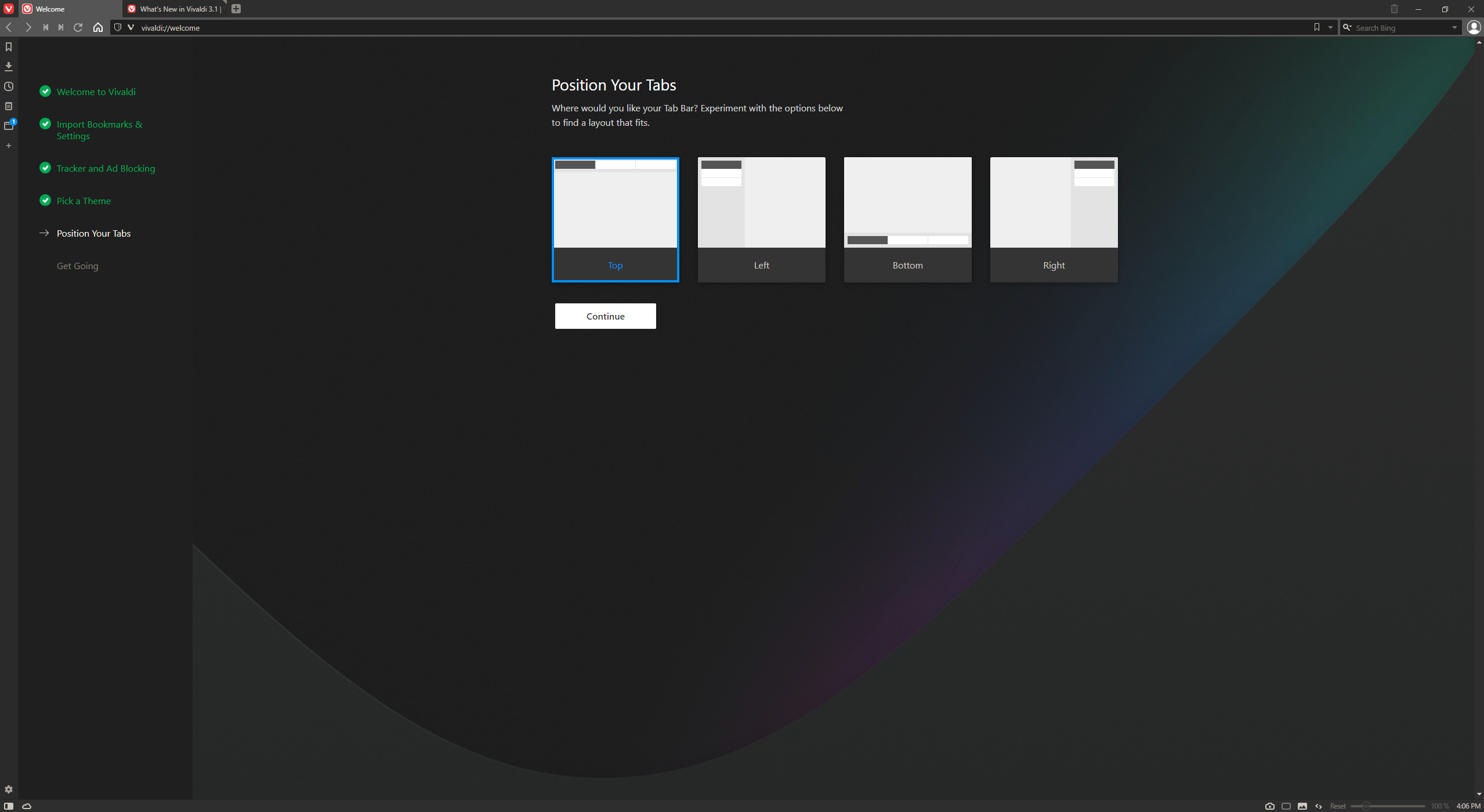
When I installed Vivaldi on my Linux computer I decided to use tabs on the side. On the one hand, one of my Windows monitors is a 2k monitor. So it’s OK to have tabs on top - I would imagine most sites are expecting users to have 1080 or lower resolution. On the other hand, it IS widescreen and many websites don’t actually take up lots of horizontal space. So why not go with a left or right tab structure (especially since I’m doing my Windows taskbar on the bottom). Since they already have a bar on the left (which I will explore in the video below), I decided to put my tabs on the right to not end up clicking on their other features by accident.
Speaking of those features, I know it might be kind of passe at this point to have bookmarks - maybe geeks/nerds just leave tabs open forever. I still use bookmarks here and there. So I like that it’s a button on the left in Vivaldi rather than being somewhat hidden in Chrome.
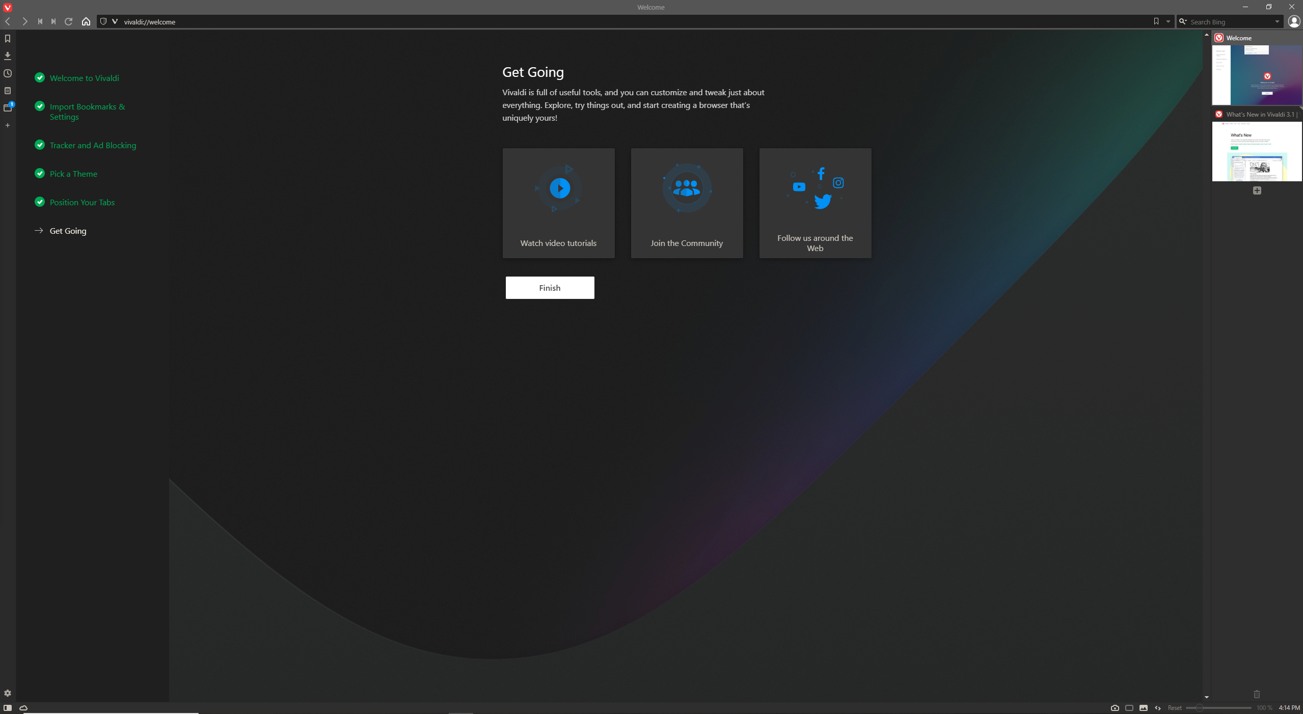 Finally, some tutorials and other helpful bits
I think it’s neat at the end that they offer up a link to video tutorials. Sometimes videos work better than words as you’ll see below. .
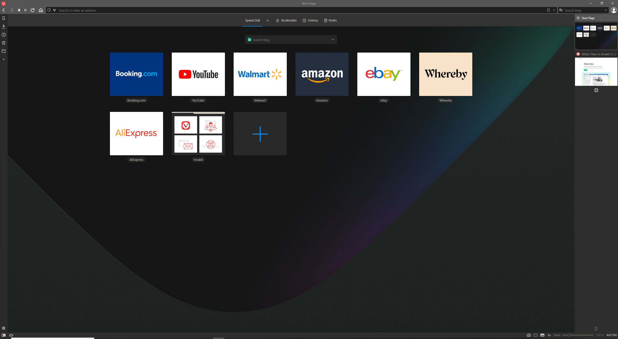
Interesting initial speed dial. These plus Bing as the default search are all paid positions. That is to say, Amazon, Walmart, and the others are all paying Vivaldi some money to be there when you first install it and until you accumulate some automated speed dial entries.
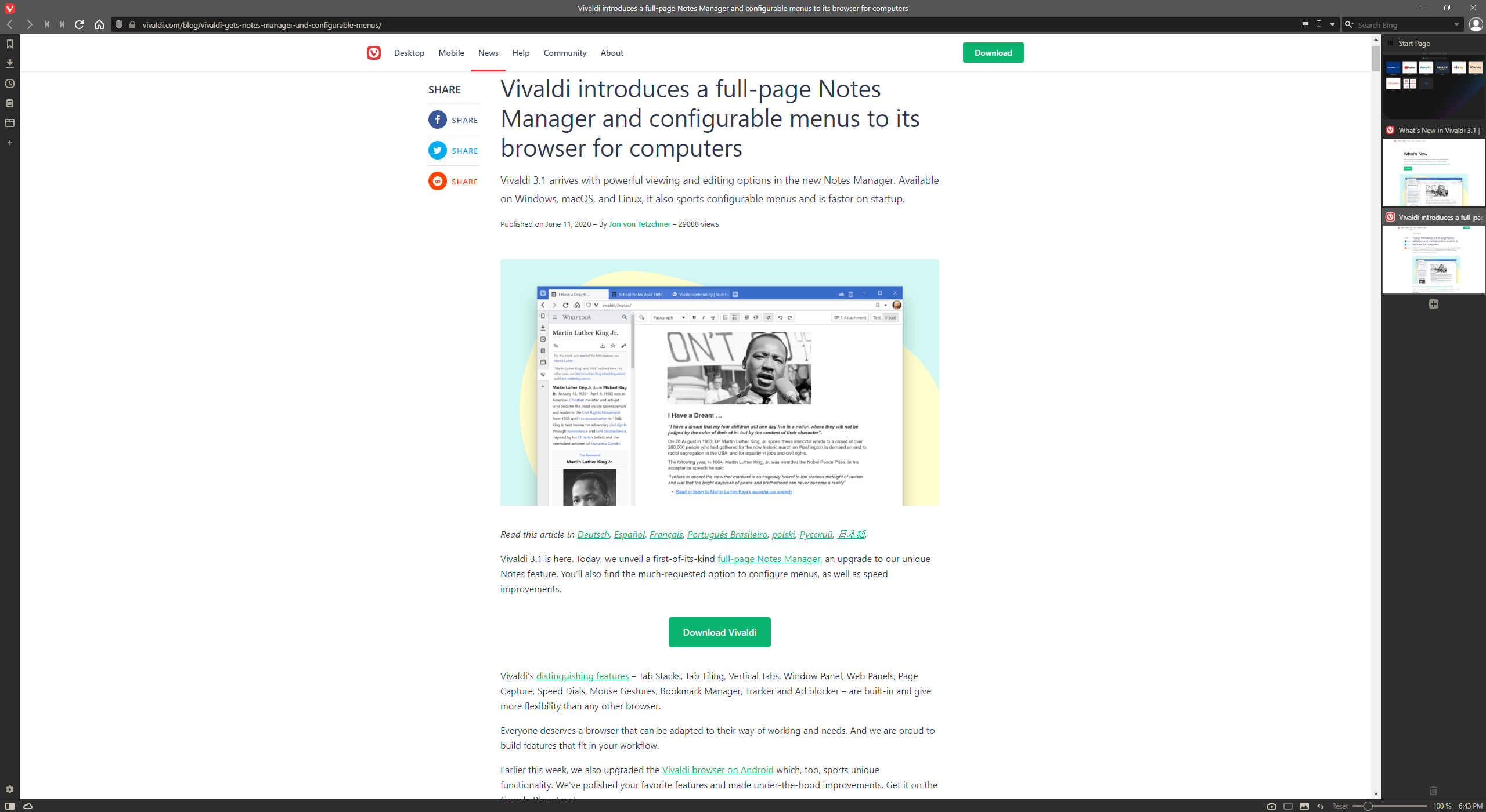 Notes feature and also showing how some websites don’t use the full width
The Notes Manager feature could make this an excellent browser for students in K-12 and College classes. Also the note-taking screenshot gives an example of how many websites are not formatted to take advantage of a widescreen view; thus it’s fine to have the tabs on the side.
Now, here’s a video where I explore the various buttons all over the UI:
Notes after using for just a few days:
So far I have had one incidence where listing the tabs on the side (instead of the top) didn’t work well. I had to reduce the tab bar on the right to the skinniest size for the YouTube upload to show the entire UI when taking up half of a 1080 screen. Why did I have it squashed to just half the screen? So that I could have the files I was dragging in to upload on the left side.
Having just learned of the existence of speeddial groups, I am already jealous that I don’t have speed dial groups at work. IT is very strict about which browsers we can have installed.